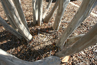
Sunday, December 7, 2008

PATHWAYS, EDGES, BOUNDARIES: phase three: oasis: open critique


The morning of the presentation, I helped set up our installation.  We tried to clear away the messy leaves and straw from the path to better show it and ended up with more stepping stones than we needed!  

I think that the open critique and presentation went well.  Along with my section and plan drawings of a couple of the stones that I made, I was in charge of the Oasis blog with help from Hannah.  I documented our process with photos from each day, each experiment, each failure, each success, and each idea in order to explain our work.  

Our guests walking through the oasis brought up things like considering how much the stones will set in the ground - if we need to actually dig a little to place them down in the ground or to just let them settle themselves.  The question about where the circle and square idea came from.  Most caught onto the squares relating to the parking spaces and building, but some questioned the circles relating to the ventilation tower, the light posts, the trees, and the curves of the islands.  But everyone had something good to say about our design.  They all liked the outlining of the path rather than a literal path, some called it clever.

I though our inside presentation turned out good as well.  The models looked nice, the photos and drawings gave a lot of information, and our oasis leader, Cassandra, did a very good job as a part of the class presentation group.  


PATHWAYS, EDGES, BOUNDARIES: phase two: oasis


While placing our stepping stones on the site, we noticed that we would need to make so many more to create an actual pathway that stretches from one side of the oasis to the next and is wide enough to be a pathway.  So we came up with the idea of outlining a pathway instead of making an actual pathway.  We arranged the stones along one side of the pathway up the the middle, then arranged the rest on the other side of the path the rest of the way, pretty much in the same spots we wanted to place the pillars.  We're considering filling in the actual path with some type of rocks or pebbles.

PATHWAYS, EDGES, BOUNDARIES: phase two: oasis


We continued casting stepping stones until the last workday.  We decided that since the pillars would take at least a month to dry to even be able to test one, we need to focus on finishing the stepping stones for the open critique and to leave the pillars for next semester if we keep them in the design.

While casting, we attempted several different textures.  First, we experimented with the crete myrtle leaves and shavings.  Then we tried to create patterns in the stones that resembled the bark of the Crete Myrtles by cutting out similar shapes from craft foam and gluing them in compositions on the bottoms of the molds.  But this idea didn't work because the foam was too thin.  After a few other attempts at texture, we finally decided that since we had so many pieces to make that we simply couldn't make elaborate molds.  Instead we needed to come up with simple ways to make and mass produce some kind of texture.  I really liked the contrast between  some of the smooth stones (from the plastic desk organizer molds) and the rougher surfaced stones from some of the cardboard molds.  I thought that this related to the contrast between the smooth bark of the trees and the ground-up pine straw/leaves on the oasis. We decided to incorporated this contrast in our development of texture.  We also allowed some of the circle stones to have a wavy texture, similar to the crete myrtle bark and the desert's texture, that we created by trial and error with wet, warped cardboard molds.  I really like our assortment of texture - I think that it not only ties in the textures of the surrounding islands, but it creates yet a greater contrast between our geometric pathway and the organic sense of the rough perlite and wavy cardboard textures.

We eventually produced enough stepping stones of varying sizes of rectangles and circles.  

PATHWAYS, EDGES, BOUNDARIES: phase two: oasis


Keeping the patterned pathway of circle and square stepping stones, we eliminated things like benches and bird baths, and decided to border the path with cylinder pillars.  We played around with different ideas for the size and placement of the pillars and eventually decided on only bordering one side of the path at a time, with pillars on one side half way, then on the other side the rest of the way.  We also decided that they should be about 8in in diameter and 2ft high.  I suggested that we make the four pillars at the center of the path (2 on one side, 2 on the other) have 12in diameters at 2ft tall to allow subtle seating, and the group liked it!

 After deciding our materials and estimating a cost, we decided to reduce the number of pillars from 13 or 14 to 8 total (4 bordering one side, 4 bordering the other).  See model.


We decided to save money and recycle: we planned on using cardboard boxes for the square stepping stones and the remains of the cardboard tube molds (for the pillars) for the circle stones.  

Everyone brought in an assortment of boxes.   We used duct tape to reinforce weak joints and repair holes.  Then we were ready for casting!
First, we tried using sawdust from the shop as an aggregate, but it made the concrete too crumbly.  Then we came up with using Perlite, which worked out great!
Corregated cardboard left a ridge texture in the concrete and pieces of it became stuck to the stepping stones.  And boxes with flaps on the bottoms or sides left deep imprints in the concrete.  But shoe boxes worked really well - the concrete popped/slid right out of them, and they gave the stones really smooth surfaces.


After the research phase of this project, the class was divided into five different groups: Gateway, Oasis, Mirage, Desert, and Living on the Edge.  I was a part of the Oasis group.

The "oasis" is the biggest island that this project involves; it's more square than rectangular, and has three Crete Myrtle trees arranged in a triangle.  Along with the rest of the class, we observed our islands and produced throw up sheets.  

We immediately noticed the existing pathway in the oasis created by foot traffic so we quickly decided to design something to enhance that pathway.  We threw out other ideas such as seating and bird baths as well, but they were turned down during our first critique.  


PATHWAYS, EDGES, BOUNDARIES: phase one: traffic and circulation


As part of the Environmental group, Meghan, Illiana, Ellie, and I, the Traffic & Circulation Group, observed and recorded the patterns of cars and people in the STAC parking lot and the environmental factors that effect those patterns.   

We each took a role in observing the lot for a week and recorded our data on copies of the plan of the parking lot.  My responsibility was to record the patterns of people walking through the lot during the day, whether its from their cars in the lot, their cars parked on Oakland Ave, Tate Street, and Highland Ave, and from their homes along Lee Street.  I noticed that most people weaved in and out of the parked cars and islands in attempts to find the quickest path.  A few people chose to walk down one side of the lot to the aisle in which their car was parked, but almost everyone stepped over/cut the corner of at least one island during their walk.  And not everyone's path lead to the STAC building just like not everyone came from cars parked in the STAC parking lot - some kept past the Gatewood, across Highland, and toward the Cury Building, down Highland to Spring Garden, or in between Graham and the Weatherspoon to get to other parts of campus.  

I also noted that when it rains, most walkers change their path to not only get to the buildings quicker, but also to avoid puddles created by the empty, shallow islands, the mud in other islands, and to avoid the risk of cars throwing water at them by staying on the sidewalk beside the building.  I also noticed from a photo that I took that the incline of the parking lot seems to be a lot more noticeable when walking on the sidewalk than when cutting across the lot - a possible reason why not many people use the sidewalk.  

The other members observed patterns of drivers during the day and during the night, and the circulation of walkers at night.  They noted things like how the cars search for a spot, where they enter and leave, that some cars only use the lot as a shortcut from Oakland to Tate, that some areas of the lot are really tight for cars to move through, which parts of the lot fill up first/last, and that people still find the quickest route at night.
Illiana and I explained all of our research during the Environmental Group's powerpoint presentation.


Sunday, October 19, 2008

1. How is dialog created?

In my final piece, dialog occurs between its two spaces as the viewer's eye moves from the left space where the rods that make up the X-shaped frames create and angle that leads the eye to the space on the right where the framing rods create another angle of the same measurement but that faces the opposite direction.  Also, the horizontal group of rods that pierce through the three prisms leads the eye back and forth between the two spaces.

2. How is a sense of space/place defined?

A sense of space is defined by the three prisms along a horizontal with a distance of 1 1/2 inches in between.

3. How is the idea of system generated?

An idea of system is generated as each element or feature of my piece works to support the others: the three prisms hold the group of four horizontal rods 2 inches from the top and bottom, and 1 1/2 inches from either side of the project.  However, those same rods also hold each prism evenly spaced at 1 1/2 inch.  And the eight rods that form two X-shapes act as two outer frames that force the prisms to stay put along the horizontal and keep them standing up straight on their 3"x 3" bases.

4. How is scale utilized in the project?

Since we were required to only use twelve 4"x 6" white planes and twelve 12" wooden skewers, almost every dimension of both solid and negative spaces relates to the number 12: each prism is 3"x 3"x 4" and made up of four folded planes each; four adjacent skewers pierce through the center of each prism and creates a 1 1/2" space between each prism, making the length of the entire project 12 inches; the three prisms make the height of the project 4 inches; along with the group of four horizontal skewers, there are two more groups of four skewers that form two X-shape frames for the project, thus there are three solid structures (the prisms) and three structural elements (the groups of skewers).

5. How do 2-D images add to the understanding of the project?

2-D images add to the understanding of my project by pointing out the elements of unity and dialog that the eye may not catch at first glance, they help explain the construction and thought processes behind the project, and they focus in on certain parts like joints or spaces.

6. How did the initial project idea evolve?

From the beginning I knew that I wanted to relate this dialog project to my final unity piece, so I immediately started out with X-shaped frames.  After I played around with a few modules of flat planes that only lead me to something too similar to my unity project, I finally started to fold the planes.  I soon came up with a paper cube.  I decided that to create two, and only two, spaces, I would need three solid structures.  Because a cube has six sides and I only had twelve planes to build three objects with, I refolded my paper and came up with a way to make a rectangular prism, rather than a cube, that only used four planes rather than six.  I had just enough planes to create three objects!  Utilizing all twelve skewers, I then made two X's, each out of six rods.  As a first iteration, I attempted to space out the three prisms and glue the ends of each X to either side of the row of prisms.  I had a row of three rectangular prisms floating between two obtuse X-shaped frames.  I liked this model a lot, but I decided that there should be something between the prisms that related them to each other more.  My next iteration was similar to the first, only this time I only used four rods for each X and used the other four horizontally pierce through the center of each prism.  I really liked this evolution, but I found that in addition to my two intended spaces between the prisms, another space was created underneath the row of prisms because only the ends of each X acted as a bas for my piece. 

Friday, October 17, 2008

DIALOG: final


(better images on the way)

Monday, October 13, 2008

DIALOG: progress


Monday, October 6, 2008

COMPARISON: UNITY

During today's UNITY critique, Catherine Maynard's unity piece stood out to me in comparison to mine. Both maintained unity in way the twelve panels were spaced along the wooden skewers yet all of her skewers, except one, were supportive in the same way as eleven pierce through the panels while the remaining rod seems to aid the project's movement. While I also pierced eight skewers through my planes for some support, my main supports were the two exterior X-shaped frames, holding the panels by their corners. Catherine's horizontal and vertical planes, along with the horizontal and one vertical rod, limit the angles of each space to 90 degrees. In contrast, I used horizontals and verticals, but the two X frames add other angles to some of the negative space.

UNITY


My final Unity piece went back to my first iteration.  However, instead of using the same angled X's at the center of the structure, I kept the two X's that connect to the top and bottom planes of either stack, and I used the remaining eight skewers, originally stacked into four more X's, to create a very obtuse X when viewed from the side as four skewers pierce through each stack of planes.  The distance between the vertex of the two vertical X's and the inside edge of the stack of planes is 3/4", equal to space between that inside edge and the column of the four rods, also spaced at 3/4", that pierce through the planes.  This evolution from my initial iteration gives this final piece a little more  physical and visual balance.  This model combines vertical, diagonal, AND horizonals, it forces acute and obtuse triangles of negative space to work together with both solid and negative rectangles.  From any way you view this piece, an X is visible rather you're looking at the vertical front and back X's or the two horizontal X's on either side as the slant's of the four piercing rods alternate. Considering proximity, I still kept the planes spaced out at 1/8" to relate to the diameters of the skewers.  There is also an element of continuation or closure as your eye is lead across the top and along the bottom of the stacks of planes.  Similar to my box for 12 twigs, the different diagonals of the rods and the support they give at the front and back and as they pierce through, as well as the purpose of the planes holding the two front and back X's in place and in line, everything works together to create a whole in my Unity project.

UNITY: graphic work


With our final UNITY piece, a parti, contour, gesture, plan, and elevation were also required for our critique.  Keeping unity between my model and my drawings, I kept my graphic work simple, like my structure, each drawing was done on a 12" by 12" plane, I used the white bristol board used in my model, and although both my final piece and drawings were simple, they all provided a lot of information.